event & apparel design • graphic design • branding
Retreat designCreating the visual theme, banner, and merchandise for an upcoming retreat event at Citylife Presbyterian Church.

1. Brainstorm
Given the retreat theme — Whole Hearted: A Blueprint for Renewal — I brainstormed several banner design options for the retreat planning committee to choose from and to base the overall retreat branding off of. After researching the referenced passage to gain a deep understanding of the theme vision, I came up with a few visual themes — city ruins, flames, heart, a vintage book effect which inspired my design drafts. After creating over 20 different drafts with different color themes, type, images and versions of each other, I finally narrowed the options down to four which were all stylistically different so as to give the retreat planning committee the freedom to choose a theme that most aligned with their vision of the overall mood, but all well-researched and relevant to the theme.
Option 1

City imagery in light of the themes of city and renewal: Joshua is repairing the temple, and the city illustration is meant to remind readers of the story and setting of Joshua. Also ties in to Citylife's identity as a church in the city and our vision of city renewal
Blue text: a subtle nod to the word "blueprint"
Wanted to provide an option with a simpler design!

Option 2
Heart imagery: an anatomical illustration of a heart, bringing in a focus on the heart as a theme that brings to focus Joshua's heart, our hearts, and God's heart in this series. I chose an anatomical illustration as a part of the blueprint/paper/book visual concept for this option
Blue background and, if you look closely, a paper texture on the whole design, as a subtle nod to the word "blueprint." While "blueprint" isn't a main focus of the sermon series, I wanted to find a way to incorporate that idea in the design as a background, secondary concept

Option 3
A more abstract option that is inspired by the visual of candle flame as a symbol of light/fire: focuses more on the idea of being used as light for those around us, as well as the fire in ourselves: being set on fire for God, and also setting to flame our old self; ties into the theme of renewal and awakening of our hearts
Light, subtle glowing text effect against a dark background to also reflect this idea of light in the darkness

Option 4
This design brings in both the city and fire imagery in light of the themes of city/local community and renewal (see above for the rationale behind these choices as visual symbols of the theme)
This design option has a vintage-y visual tone, almost like an old book, through the use of the serif font, black printed effect on the images, and off-white background color
2. Refine
I presented these options and thoughts behind each design to my team to further refine item ideas and get feedback. After much discussion and series of voting, we went ahead with option 1. Some feedback I received was to add event information, and to change the background color to white in order to make it easier to keep consistent branding across other event-related designs and items such as the booklet, and lanyards. I also edited the tone of the blue tone to be easier on the eyes, since the design would be presented on a large screen. After these edits, this was the final draft:

3. Implement
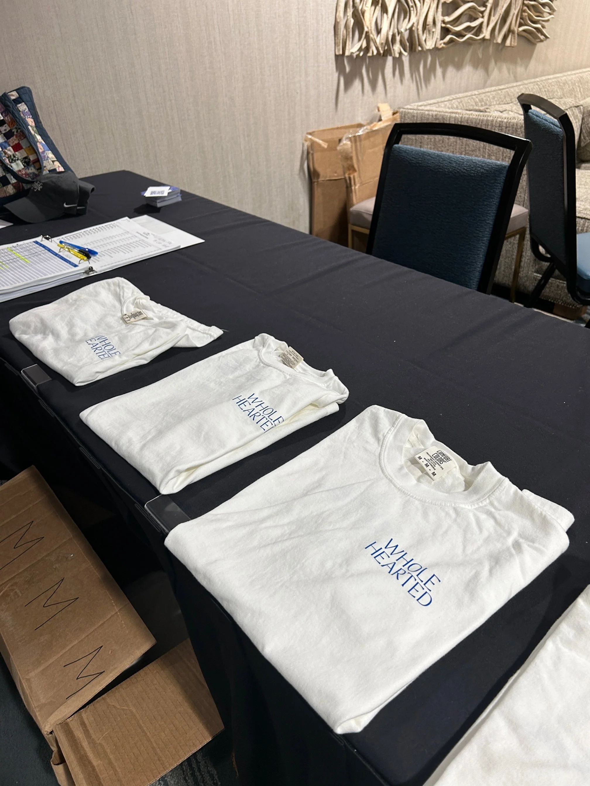
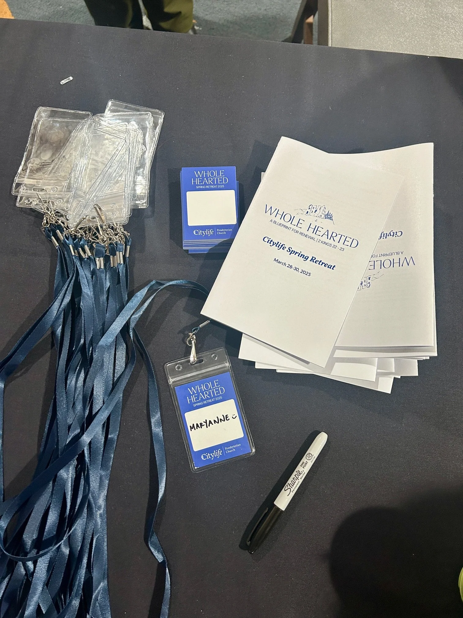
Based on the banner theme, we made matching branded event merchandise: